What Will It Look Like#
-
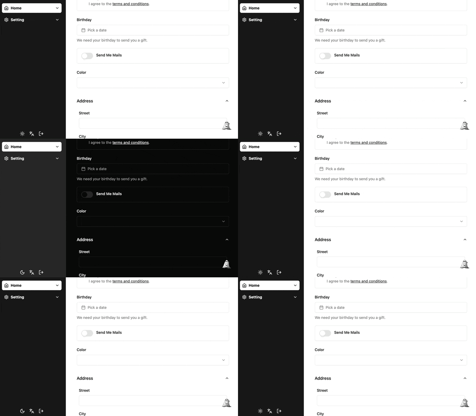
In terms of appearance and interaction:
-
There is only one button that toggles by clicking, rather than a three-option Dropdown Menu.
-
Server-rendering friendly, the button can directly reflect whether the current theme is dark.
-
There will be no flickering when the page refreshes.
-
The overall transition of the page color during the switch will be consistent.
-
In terms of processing logic:
-
User preferences can be persisted to browser storage.
-
User preferences can be seamlessly restored to system preferences.

I will use Jotai to implement this, I like Jotai.
Get System Preference Status#
Use Media queries with prefers-color-scheme and matchMedia to determine whether the system preference is dark.
The onMount function executes when the atom is subscribed and runs the returned function when unsubscribed. Add logic to check the browser environment to be compatible with server-side rendering.
function atomSystemDark() {
  const isSystemDarkAtom = atom<boolean | null>(null);

  isSystemDarkAtom.onMount = (set) => {
    if (typeof window === "undefined") return;
    const matcher = window.matchMedia("(prefers-color-scheme: dark)");
    const update = () => {
      set(matcher.matches);
    };
    update();
    matcher.addEventListener("change", update);
    return () => {
      matcher.removeEventListener("change", update);
    };
  };
  return isSystemDarkAtom;
}
When Should It Be Dark#
- The user's preference is dark.
- The system preference is dark, and the user's preference is not light.
type Theme = "system" | "light" | "dark";

function isDarkMode(setting?: Theme | null, isSystemDark?: boolean | null) {
  return setting === "dark" || (!!isSystemDark && setting !== "light");
}
Reading and Switching Dark State#
- Read the user's theme preference and system preference to determine if it is currently dark mode, using atomWithStorage to store the user's theme preference in the browser (Fixes 2-1).
- Use jotai-effect to handle side effects, synchronize the state to the HTML page, and when the user preference matches the current system preference, restore the user preference to the system preference (Fixes 2-2).
- The click callback for the toggle button does not receive parameters, updating the user preference based on the current user preference and system preference.
function atomDark() {
  const isSystemDarkAtom = atomSystemDark();
  const themeAtom = atomWithStorage<Theme>(storageKey, "system");

  const toggleDarkEffect = atomEffect((get, set) => {
    const theme = get(themeAtom);
    const isSystemDark = get(isSystemDarkAtom);
    const isDark = isDarkMode(theme, isSystemDark);
    document.documentElement.classList.toggle("dark", isDark);

    if (
      (theme === "dark" && isSystemDark) ||
      (theme === "light" && !isSystemDark)
    ) {
      set(themeAtom, "system");
    }
  });

  return atom(
    (get) => {
      get(toggleDarkEffect);
      const theme = get(themeAtom);
      const isSystemDark = get(isSystemDarkAtom);
      return isDarkMode(theme, isSystemDark);
    },
    (get, set) => {
      const theme = get(themeAtom);
      const isSystemDark = get(isSystemDarkAtom);
      set(
        themeAtom,
        theme === "system" ? (isSystemDark ? "light" : "dark") : "system"
      );
    }
  );
}
We Have Usable Hook Now#
Creating a custom hook for atomDark is a better choice than directly using the atom. Since Jotai's write function is not reactive, directly using the atom may only utilize the toggleDark function, resulting in incorrect state readings.
const isDarkAtom = atomDark();

function useDark() {
  const isDark = useAtomValue(isDarkAtom);
  const toggleDark = useSetAtom(isDarkAtom) as () => void;
  return { isDark, toggleDark };
}
Let's Have a Button#
- Use tailwindcss-icons and Lucide to introduce icons representing the current theme state (Fixes 1-1).
- By using Tailwind's Dark Mode support to correctly display the state icon without reading the
isDarkstate, making it server-rendering friendly (Fixes 1-2). - Add a little transition animation effect.
function AppearanceSwitch() {
  const { toggleDark } = useDark();

  return (
    <button onClick={toggleDark} className="flex">
      <div className="i-lucide-sun scale-100 dark:scale-0 transition-transform duration-500 rotate-0 dark:-rotate-90" />
      <div className="i-lucide-moon absolute scale-0 dark:scale-100 transition-transform duration-500 rotate-90 dark:rotate-0" />
    </button>
  );
}
How to Solve Page Flickering?#
When the styles of the page loaded by the browser are inconsistent with user preferences, page flickering occurs during style updates. We need to inject a script before the page loads to ensure the theme is correct (Fixes 1-3).
If you are using Vite, you can inject the script in index.html:
<script>
  !(function () {
    var e =
        window.matchMedia &&
        window.matchMedia("(prefers-color-scheme: dark)").matches,
      t = localStorage.getItem("use-dark") || '"system"';
    ('"dark"' === t || (e && '"light"' !== t)) &&
      document.documentElement.classList.toggle("dark", !0);
  })();
</script>
If you are using Next.js, you can use dangerouslySetInnerHTML to inject the script. It is worth mentioning that we need to use suppressHydrationWarning to ignore React's warnings during client hydration. This is because we switched the className of the html node on the client side, which may be inconsistent with the server-rendered result.
function ThemeProvider({ children }: { children: React.ReactNode }) {
  return (
    <>
      <script
        dangerouslySetInnerHTML={{
          __html: "here",
        }}
      ></script>
      {children}
    </>
  );
}

function RootLayout({ children }: { children: React.ReactNode }) {
  return (
    <html suppressHydrationWarning>
      <body>
        <ThemeProvider>{children}</ThemeProvider>
      </body>
    </html>
  );
}
Disable Transition When Switching#
The article Disable transitions on theme toggle explains in detail the reason for doing this. We do not want the color transitions of some components to be inconsistent with the rhythm of the page theme transitions during the switch (Fixes 1-4).

This is great, but our theme toggle button uses transition, so we need to whitelist certain components, which can be achieved using the CSS :not pseudo-class.
/**
 * credit: https://github.com/pacocoursey/next-themes/blob/cd67bfa20ef6ea78a814d65625c530baae4075ef/packages/next-themes/src/index.tsx#L285
 */
export function disableAnimation(disableTransitionExclude: string[] = []) {
  const css = document.createElement("style");
  css.append(
    document.createTextNode(
      `
*${disableTransitionExclude.map((s) => `:not(${s})`).join("")} {
  -webkit-transition: none !important;
  -moz-transition: none !important;
  -o-transition: none !important;
  -ms-transition: none !important;
  transition: none !important;
}
      `
    )
  );
  document.head.append(css);

  return () => {
    // Force restyle
    (() => window.getComputedStyle(document.body))();

    // Wait for next tick before removing
    setTimeout(() => {
      css.remove();
    }, 1);
  };
}
Finally#
After addressing the above issues, I now have a satisfactory dark mode toggle button. I have published it on npm, and you can use it directly. You can view the complete code and examples on GitHub.
Github Repo not found
The embedded github repo could not be found…